The non-scholarly write up – Wordclouds in R : Oh, The possibilities!

Standard

Okay, so I am stoked to report that I can now build them pretty wordclouds ! I am even more pleased with how easy the process is. There’s a whole array of plots you can play around with, including :

Commonality Cloud : Allows you to view words common to both corpora

Comparison Cloud: Allows you view words which are not common to both the corpora

Polarized Plot: A better take on the commonality cloud, allowing you to tell which corpra                                   has a greater concentration of a particular word.

Visualized word Network : shows the network of words associated with a main word.

Let’s jump right into it.

Step 1: Load libraries

require("tm") # the text mining package
require("qdap") # for qdap package's cleaning functions
require("twitteR") # to connect to twitter and extract tweets
require("plotrix") # for the pyramid plot

Step 2: Read in your choice of tweets

After connecting to twitter, I downloaded 5000 tweets each found from a search of the key words “hillary” and “trump”. And this was minutes after the US elections 2016 results were declared . Twitter has never been so lit!

hillary<-searchTwitter("hillary",n=5000,lang = "en")
trump<- searchTwitter("trump",n=5000,lang="en")


Step 3: Write and apply functions to perform data transformation and                       cleaning

a) Function to extract text from the tweets which get downloaded in the list form.We do this using  getText  which is an accessor method.

convert_to_text <- function(x){
 x$getText()
 }

b) Function to process our tweets to remove duplicates and  urls.

replacefunc <- function(x){
 gsub("https://(.*)", "", x)
 
}


replace_dup <- function(x){
 gsub("^(rt|RT)(.*)", "", x)
 
}

c) Function to further clean the character vector , for example, to remove brackets, replace abbreviations and symbols with their word equivalents and  contractions with their fully expanded versions.

clean_qdap <- function(x){
 x<- bracketX(x)
 x<- replace_abbreviation(x)
 x<- replace_contraction(x)
 x<- replace_symbol(x)
 x<-tolower(x)
 return(x)
}

d) Apply the above functions

hillary_text <- sapply(hillary,convert_to_text)
hillary_text1 <- hillary_text
hill_remove_url<- replacefunc(hillary_text1)
hill_sub <- replace_dup(hill_remove_url)
hill_indx <- which(hill_sub=="")
hill_sub_complete <- hill_sub[-hill_indx]

trump_text <- sapply(trump,convert_to_text)
trump_text1 <- trump_text
trump_remove_url<- replacefunc(trump_text1)
trump_sub <- replace_dup(trump_remove_url)
trump_indx <- which(trump_sub=="")
trump_sub_complete <- trump_sub[-trump_indx]

# encode to UTF-8 : capable of encoding all possible characters defined by unicode
trump_sub_complete <- paste(trump_sub_complete,collapse=" ")
Encoding(trump_sub_complete) <- "UTF-8"
trump_sub_complete <- iconv(trump_sub_complete, "UTF-8", "UTF-8",sub='') 
                         #replace non UTF-8 by empty space
trump_clean <- clean_qdap(trump_sub_complete)
trump_clean1 <- trump_clean

hill_sub_complete <- paste(hill_sub_complete,collapse=" ")
Encoding(hill_sub_complete) <- "UTF-8"
hill_sub_complete <- iconv(hill_sub_complete, "UTF-8", "UTF-8",sub='') 
                     #replace non UTF-8 by empty space
hillary_clean <- clean_qdap(hill_sub_complete)
hillary_clean1 <- hillary_clean


Step 4: Convert the character vectors to VCorpus objects

trump_corpus <- VCorpus(VectorSource(trump_clean1))
hill_corpus <- VCorpus(VectorSource(hillary_clean1))


Step 5: Define and apply function to  format the corpus object 

clean_corpus <- function(corpus){
 corpus <- tm_map(corpus, removePunctuation)
 corpus <- tm_map(corpus, stripWhitespace)
 corpus <- tm_map(corpus, removeNumbers)
 corpus <- tm_map(corpus, content_transformer(tolower))
 corpus <- tm_map(corpus, removeWords, 
 c(stopwords("en"),"supporters","vote","election","like","even","get","will","can"
,"amp","still","just","will","now"))
 return(corpus)
}

trump_corpus_clean <- clean_corpus(trump_corpus)
hill_corpus_clean <- clean_corpus(hill_corpus)
  • Note : qdap cleaner functions can be used with character vectors, but tm functions need a corpus as input.

Step 6: Convert the corpora into TermDocumentMatrix(TDM) objects

Tdmobjecthillary <- TermDocumentMatrix(hill_corpus_clean1)
Tdmobjecttrump <- TermDocumentMatrix(trump_corpus_clean1)

Step 7: Convert the TDM objects into matrices

Tdmobjectmatrixhillary <- as.matrix(Tdmobjecthillary)
Tdmobjectmatrixtrump <- as.matrix(Tdmobjecttrump)


Step 8: Sum rows and create term-frequency dataframe

Freq <- rowSums(Tdmobjectmatrixhillary)
Word_freq <- data.frame(term= names(Freq),num=Freq)

Freqtrump <- rowSums(Tdmobjectmatrixtrump)
Word_freqtrump <- data.frame(term= names(Freqtrump),num=Freqtrump)

Step 9: Prep for fancier wordclouds

# unify the corpora
cc <- c(trump_corpus_clean,hill_corpus_clean)

# convert to TDM
all_tdm <- TermDocumentMatrix(cc)
colnames(all_tdm) <- c("Trump","Hillary")

# convert to matrix
all_m <- as.matrix(all_tdm)


# Create common_words
common_words <- subset(all_tdm_m, all_tdm_m[, 1] > 0 & all_tdm_m[, 2] > 0)

# Create difference
difference <- abs(common_words[, 1] - common_words[, 2])

# Combine common_words and difference
common_words <- cbind(common_words, difference)

# Order the data frame from most differences to least
common_words <- common_words[order(common_words[, 3], decreasing = TRUE), ]

# Create top25_df
top25_df <- data.frame(x = common_words[1:25, 1], 
 y = common_words[1:25, 2], 
 labels = rownames(common_words[1:25, ]))

Step 10: It’s word cloud time!


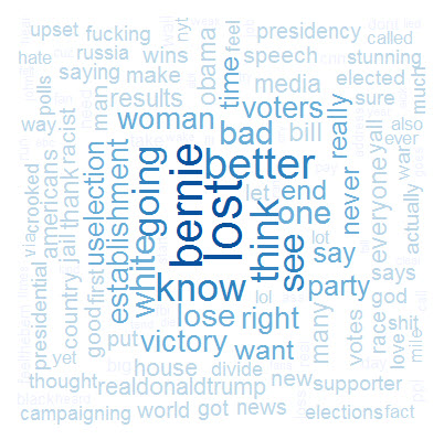
a) The ‘everyday’ cloud

wordcloud(Word_freq$term, Word_freq$num, scale=c(3,0.5),max.words=1000, 
          random.order=FALSE, rot.per=0.35, use.r.layout=FALSE, 
          colors=brewer.pal(5, "Blues"))

wordcloud(Word_freqtrump$term, Word_freqtrump$num, scale=c(3,0.5),max.words=1000,
          random.order=FALSE, rot.per=0.35, use.r.layout=FALSE,
          colors=brewer.pal(5, "Reds"))

2016-11-09_22-19-43trumpnew


b) The Polarized pyramid plot

# Create the pyramid plot
pyramid.plot(top25_df$x, top25_df$y, labels = top25_df$labels, 
 gap = 70, top.labels = c("Trump", "Words", "Hillary"), 
 main = "Words in Common", laxlab = NULL, 
 raxlab = NULL, unit = NULL)

2016-11-11_19-55-31.jpg


c) The comparison cloud 

comparison.cloud(all_m, colors = c("red", "blue"),max.words=100)

2016-11-11_19-59-18.jpg

d) The commonality cloud 

commonality.cloud(all_m, colors = "steelblue1",max.words=100)

2016-11-09_22-19-43.jpg


We made it!  That’s it for this post, folks.

Coming up next: Mining deeper into text.


THE NON-SCHOLARLY WRITE-UP : LeNet architecture applied to the MNIST dataset: 99% accuracy.

Standard

For about a week or so , I have been working on the ‘Digit Recognizer’ competition over at Kaggle. I started out with my favourite go-to algorithm: Random Forest, and eventually moved on to other implementations and variations including

  • KNN
  • KNN with PCA
  • XGBoost
  • deeplearning with H2O
  • GBM with H2O
  • Ensembling

And then I plateaued at 97.8% .

A quick google search not too different from ‘ improve score + Digit Recognizer +MNIST’, threw up a bunch of pages all of which seemed to talk about Neural Networks.I’m like huh? Isn’t that biology?

Sure is. Who’da thunk it!

Anyway ,I spent  considerable time pouring over a few AMAZING bookmark-able resources and implemented my first ConvNet (I feel so accomplished!).

The implementation in question is called the LeNet. One of the best convolutional networks is the LeNet architecture that is used to read zip codes, digits, etc.

2016-10-30_17-47-05.jpg

The model consists of a convolutional layer followed by a pooling layer, another convolution layer followed by a pooling layer, and then two fully connected layers similar to the conventional multilayer perceptrons.

Step 1: Load libraries

install.packages("drat")
require(drat)
drat::addRepo("dmlc")
install.packages("mxnet")
require(mxnet)

Step 2: Read the datasets

These are available from the Kaggle ‘Digit Recognizer’ competition page here.

Here every image is represented as a single row. The pixel range for each image lies between 0 and 255.

trainorig <-read.csv("C:/Users/Amita/Downloads/train.csv",header=T,sep=",")
testorig <-  read.csv("C:/Users/Amita/Downloads/test.csv",header=T,sep=",")

Step 3: Convert the training and testing datasets into matrices

train<-data.matrix(train)
test<-data.matrix(test)

Step 4: Extract the labels

train.x<-train[,-1]
train.y<-train[,1] # labels
test<-test[,-1]

Step 5: Scale the data and transpose  the matrices since mxnet seems to prefer observations in columns instead of rows.

train.x<-t(train.x/255)
test<-t(test/255)

The transposed matrix contains data in the form npixel x nexample.

Step 6: Convert the matrices into arrays for lenet

train.array <- train.x
 dim(train.array) <- c(28, 28, 1, ncol(train.x))
 test.array <- test
 dim(test.array) <- c(28, 28, 1, ncol(test))

Each input x is a 28x28x1 array representing one image, where the first two numbers represent the width and height in pixels, the third number is the number of channels (which is 1 for grayscale images, 3 for RGB images).

Step 7: Configure the structure of the network

# Convolutional NN
 data <- mx.symbol.Variable('data')
 devices<-mx.cpu()
 # first conv
 conv1 <- mx.symbol.Convolution(data=data, kernel=c(5,5), num_filter=20)
 relu1 <- mx.symbol.Activation(data=conv1, act_type="relu")
 pool1 <- mx.symbol.Pooling(data=relu1, pool_type="max",
 kernel=c(2,2), stride=c(2,2))
 # second conv
 conv2 <- mx.symbol.Convolution(data=pool1, kernel=c(5,5), num_filter=50)
 relu2 <- mx.symbol.Activation(data=conv2, act_type="relu")
 pool2 <- mx.symbol.Pooling(data=relu2, pool_type="max",
 kernel=c(2,2), stride=c(2,2))
 # first fullc
 flatten <- mx.symbol.Flatten(data=pool2)
 fc1 <- mx.symbol.FullyConnected(data=flatten, num_hidden=500)
 relu3 <- mx.symbol.Activation(data=fc1, act_type="relu")
 # second fullc
 fc2 <- mx.symbol.FullyConnected(data=relu3, num_hidden=10)
 # loss
 lenet <- mx.symbol.SoftmaxOutput(data=fc2)

Step 8: Train the model

 mx.set.seed(0)
 
 model <- mx.model.FeedForward.create(lenet, X=train.array, y=train.y,
 ctx=devices, num.round=20, array.batch.size=100,
 learning.rate=0.05, momentum=0.9, wd=0.00001,
 eval.metric=mx.metric.accuracy,
 epoch.end.callback=mx.callback.log.train.metric(100))

Step 9: predict on the test dataset and calculate accuracy

preds <- predict(model, test.array) 
pred.label <- max.col(t(preds)) - 1
sum(diag(table(test_org[,1],pred.label)))/8400

Step 10: Predict on the final test dataset and submit to Kaggle

# predict on the kaggle dataset 
 testorig <- as.matrix(testorig)
 testorig<-t(testorig/255)
 testorig.array <- testorig
 dim(testorig.array) <- c(28, 28, 1, ncol(testorig))

 predtest<-predict(model,testorig.array)
 
 predlabel<-max.col(t(predtest))-1
 predictions <- data.frame(ImageId=1:nrow(testo), Label=predlabel)
write.csv(predictions, "CNN.csv",row.names=FALSE)

and *ba-dum-tsss* !!! a 0.99086 !

If anybody has any ideas on how to improve this score , please share! TIA!

References:

The non-scholarly write-up : Logistic Regression with XGBoost.

Standard

This post is a long time coming.

 UPDATE: I have inched my way to the top 13% of the titanic competition (starting out at the ‘top’ 85%, who’d a thunk it. I love persevering. :D)

Anyway.

My last attempt involved XGBoost (Extreme Gradient Boosting) , which did not beat my top score – It barely scraped past a 77%. That being said, I thought it deserved a dedicated post considering I have achieved great results with the algorithm on other Kaggle competitions.

In a nutshell, it

  • is a very, very fast version of the GBM,
  • needs parameter tuning which can get pretty frustrating (But hey, patience is a virtue!)
  • Supports cross validation
  • is equiped to help find the variable importance
  • is robust to outliers and noisy data


Cutting to the chase.

Step 1: Load libraries

require(xgboost)
require(Matrix)

Step 2: Read the datasets

dat<-read.csv("C:/Users/Amita/Downloads/train (1).csv",header=T,sep=",",
              na.strings = c(""))
test <- read.csv("C:/Users/Amita/Downloads/test (1).csv",header=T,sep=",",
              na.strings = c(""))

Step 3:  Process the datasets

This is the same process as outlined in a previous blog post.

Step 4:  Extract the response variable column

label <- dat$Survived
dat <- dat[,-2] # remove the 'Survived' response column from the training dataset

Step 5:  Combine the training and test datasets

combi <- rbind(dat,test)

Step 6: Create a sparse matrix  to ‘dummify’ the categorical variables i.e. convert all categorical variables to binary

One thing to remember with XGBoost is that it ONLY works with numerical data types. So datatype conversion is necessary before you proceed with model building.

data_sparse <- sparse.model.matrix(~.-1, data = as.data.frame(combi))
cat("Data size: ", data_sparse@Dim[1], " x ", data_sparse@Dim[2], " \n", sep = "")

If you’re familiar with the ‘caret’ package, it has a pretty cool dummyVars function do this exactly what we did above.

# dummify the data
dummify <- dummyVars(" ~ .", data = combi)
finaldummy <- data.frame(predict(dummify, newdata = combi))

Here, dummyVars will transform all characters and factors columns (the function never transforms numeric columns) and return the entire data set.


Step 7: Divide the dummified back into train and test

dtrain <- xgb.DMatrix(data = data_sparse[1:nrow(dat), ], label = label)
dtest <- xgb.DMatrix(data = data_sparse[(nrow(dat)+1):nrow(combi), ])

Step 8: Cross Validate

In order to evaluate the overfit and underfit of the models,we compute cross validation error.

set.seed(12345678) # for reproducibility

cv_model <- xgb.cv(data = dtrain,
 nthread = 8,  # number of threads allocated to the execution of XGBoost
 nfold = 5,  # the original data is divided into 4 equal random samples
 nrounds = 1000000, # number of iterations
 max_depth = 6, # maximum depth of a tree
 eta = 0.05, # controls the learning rate. 0 < eta < 1
 subsample = 0.70, #subsample ratio of the training instance. 
 colsample_bytree = 0.70, #subsample ratio of columns when constructing each tree
 booster = "gbtree", # gbtree or gblinear
 eval_metric = "error", #binary classification error rate
 maximize = FALSE, #maximize=TRUE means the larger the evaluation score the better
 early_stopping_rounds = 25, # training with a validation set will 
                             # stop if the performance keeps getting worse 
                             # consecutively for k rounds.
 objective = "reg:logistic", # logistic regression
 print_every_n = 10, # output is printed every 10 iterations
 verbose = TRUE) # print the output 

Everything you need to know about the xgb.cv parameters and beyond is answered here https://github.com/dmlc/xgboost/blob/master/doc/parameter.md

Step 9: Build model

temp_model <- xgb.train(data = dtrain,
 nthread = 8,
 nrounds = cv_model$best_iteration,
 max_depth = 6,
 eta = 0.05,
 subsample = 0.70,
 colsample_bytree = 0.70,
 booster = "gbtree",
 eval_metric = "error",
 maximize = FALSE,
 objective = "reg:logistic",
 print_every_n = 10,
 verbose = TRUE,
 watchlist = list(trainrep = dtrain))

Easy reference : https://rdrr.io/cran/xgboost/man/xgb.train.html

Step 10: Predict ‘Survived’ values.

prediction <- predict(temp_model,dtest)
prediction <- ifelse(prediction>0.5,1,0)


Step 11: Check  and plot the variable importance

Certain predictors drag down the performance of the model even though it makes complete sense gut-wise to keep them there. On a couple of occasions,variable importance has helped me decide the relevance of the predictors, which positively impacted the accuracy of my model.

importance <- xgb.importance(feature_names = data_sparse@Dimnames[[2]], 
              model = temp_model) #Grab all important features
xgb.plot.importance(importance) #Plot

2016-10-27_16-52-20.jpg


For everything XGBoost, I frequented this page and this page . Pretty thorough resources, IMHO.

Annnd, that’s pretty much it!

Go get ’em!

Top 16% : How to plateau using the ‘Feature Engineering’ approach.

Standard

Ladies and Gents! I am now placed in the top 16% of the leaderboard rankings with a score of .80383.

2016-10-14_10-08-27


I have also plateaued horribly. No matter what other features I try to ‘engineer’ my score just won’t budge. It get’s worse, sure, but never better. Bummer.

Everything pretty much remains the same as the previous post in terms of data reading and cleaning. In this post, let’s look at what I did differently.

This attempt was a departure from applying the algorithms as is and hoping for a better prediction (Admit it.We’re all guilty.) This time I incorporated the ‘human’ element – I even tried to recall scenes from the movie for that extra insight(Still unfair how Rose hogged the entire wooden plank).

Some of the theories I considered:

  • Women and children were given priority and evacuated first.
  • Mothers would look out for their children.
  • First class passengers were given priority over those in 2nd or 3rd class.
  • Women and children were probably given priority over males in every class.
  • Families travelling together probably had a better chance of survival since they’d try to stick together and help each other out.
  • Older people would have trouble evacuating and hence, would have lower odds of survival.


Also, this time around, I played around with the ‘Name’ and ‘Cabin’ variables and that made a huge diffference!

So what you need to do to plateau with an 80.4% prediction is as follows:

Identify the unique titles and create a new variable unique:

# check for all the unique titles 

unique <- gsub(".*?,\\s(.*?)\\..*$","\\1",dat$Name)

dat$unique<- unique
dat$unique[dat$unique %in% c("Mlle","Mme")] <-"Mlle"
dat$unique[dat$unique %in% c('Capt', 'Don', 'Major', 'Sir')] <- 'Sir'
dat$unique[dat$unique %in% c('Dona', 'Lady', 'the Countess','Jonkheer')] <- 'Lady'

table(dat$unique) # check the distribution of different titles

# passenger’s title 
dat$unique <- factor(dat$unique)

Identify the children and create a new variable isChild  :

dat$ischild <- factor(ifelse(dat$Age<=16,"Child","Adult"))

Identify the mothers and create a new variable isMother:

dat$isMother<- "Not Mother"
dat$isMother[dat$Sex=="female" & dat$Parch>0 & unique!="Miss"] <- "Mother"
dat$isMother<- factor(dat$isMother)

Uniquely identify the Cabins: This variable leads to somewhat of an overfit.

dat$Cabin <- substr(dat$Cabin,1,1)
dat$Cabin[dat$Cabin %in% c("F","G","T",NA)] <- "X"
dat$Cabin<- factor(dat$Cabin)

Compute the family size and create a new variable familysize :

dat$familysize <- dat$SibSp + dat$Parch + 1

Use the ‘familysize‘ variable and the surname of the passenger to designate the family size as “Small” or “Big” in the new variable unit :

pass_names <- dat$Name
extractsurname <- function(x){
  if(grepl(".*?,\\s.*?",x)){
  gsub("^(.*?),\\s.*?$","\\1",x)
 }
}

surnames <- vapply(pass_names, FUN=extractsurname,FUN.VALUE = character(1),USE.NAMES = F)
fam<-paste(as.character(dat$familysize),surnames,sep=" ")


famsize<- function(x){
 if(substr(x,1,2) > 2){
 
 x <- "Big"
 }else{
 x <- "Small"
 }
}

unit <- vapply(fam, FUN=famsize,FUN.VALUE = character(1),USE.NAMES = F)
dat$unit <- unit
dat$unit <- factor(dat$unit)


Split the ‘dat’ dataset into train and test (60 : 40 split) and fit the randomforest model.

n<- nrow(dat)
shuffled <- dat[sample(n),]

traindat <- shuffled[1:round(0.6*n),]
testdat<- shuffled[(round(0.6*n) + 1):n,]

dim(traindat)
dim(testdat)

require(caret)
require(ranger)
model <- train(
 Survived ~.,
 tuneLength = 50,
 data = traindat, method ="ranger",
 trControl = trainControl(method = "cv", number = 5, verboseIter = TRUE)
)

pred <- predict(model,newdata=testdat[,-2])
conf<- table(testdat$Survived,pred)
accuracy<- sum(diag(conf))/sum(conf)
accuracy

Using the model to predict survival (minus Cabin) gives us 83.14% accuracy on our test data’testdat’ and 80.34% on Kaggle.

Using the model to predict survival (with Cabin) gives us 83.71% accuracy on our test data’testdat’ which drops to around 79% on Kaggle.

Although, I still haven’t tinkered around with ‘Fare’, ‘Ticket’, and ‘Embarked’ (the urge to do so is strong), I think I’ll just leave it alone for the time being – but I will be revisiting for that elusive ‘eureka’ moment!

You can find the code here .


Learning from Disaster – The Random Forest Approach.

Standard

Kaggle update:

I’m up 1,311 spots a week from my previous week’s submission. Yay!

2016-10-09_17-11-01

Having tried logistic regression the first time around, I moved on to decision trees and KNN. But unfortunately, those models performed horribly and had to be scrapped.

Random Forest seemed to be the buzz word around the Kaggle forums, so I obviously had to try it out next. I took a couple of days to read up on it, worked out a few examples on my own before re-taking a stab at the titanic dataset.

The ‘caret’ package is a beauty. Seems to be the most widely used package for supervised learning too. I cannot get over how simple and consistent it makes predictive modelling.So far I have been able to do everything from data splitting, to data standardization, to model building, to model tuning – all using one package. And I am still discovering all that it has to offer. Pretty amazing stuff.

I will give you a super quick walk-through of how I applied the random forest algorithm and then go enjoy whatever’s left of my Sunday.


Read In The Data:

dat<-read.csv("C:/Users/Amita/Downloads/train (1).csv",header=T,sep=",",
     na.strings = c(""))
test <- read.csv("C:/Users/Amita/Downloads/test (1).csv",header=T,sep=",",
     na.strings = c(""))

Check For Missing Values:

sapply(dat,function(x){sum(is.na(x))}) 

sapply(test,function(x){sum(is.na(x))})

2016-10-09_17-50-11.jpg

The variable ‘Cabin’ seems to have the most missing values and is quite beyond repair – so we’ll drop it. Also, I really don’t think ‘Name’ and ‘Ticket’ could possibly have any relation to the odds of surviving. So we’ll drop that as well. (So reckless! :D)

‘Age’ has quite a few missing values as well, but I have a hunch we’ll need that .So we need to replace the missing values there.


dat[is.na(dat$Age),][6]<- mean(dat$Age,na.rm=T)
dat <- dat[,-c(4,9,11)]

test[is.na(test$Age),][5]<- mean(test$Age,na.rm=T) 
test <- test[,-c(3,8,10)]


Next, we’ll split the complete training dataset ‘dat’ into two sub-datasets which we shall use for testing our model. Let’s go for a 60:40 split.

set.seed(50)
n<- nrow(dat)
shuffled <- dat[sample(n),]
traindat <- shuffled[1:round(0.6*n),]
testdat<- shuffled[(round(0.6*n) + 1):n,]


For this tutorial, we need to install the ‘caret’ package. I am not going to use the ‘randomforest’ package , but instead use the ‘ranger’ package which is supposed to provide a much faster implementation of the algorithm.

install.packages("caret")
install.packages("ranger")
library(caret)
library(ranger)

A little more cleaning prompted by errors thrown along the way. Gotta remove all NAs.

sum(is.na(traindat))
sum(is.na(testdat))

traindat[is.na(traindat$Embarked),][["Embarked"]]<-"C"
testdat[is.na(testdat$Embarked),][["Embarked"]]<-"C"

testdat$Survived<-factor(testdat$Survived)
traindat$Survived<-factor(traindat$Survived)

Convert the ‘Survived’ variable to a factor so that caret builds a classification instead of a regression model.

testdat$Survived<-factor(testdat$Survived)
traindat$Survived<-factor(traindat$Survived)


Build The Model:

model <- train(
 Survived ~.,
 tuneLength = 50,
 data = traindat, method ="ranger",
 trControl = trainControl(method = "cv", number = 5, verboseIter = TRUE)
)

As you can see, we are doing a bunch of things in one statement.

The model being trained uses ‘Survived’ as the response variable and all others as predictors. The input dataset is ‘traindat’. The tuneLength argument to caret::train() tells train to explore more models along it’s default tuning grid. A higher value of tuneLength means more accurate results since it evaluates more models along it’s default tuning grid , but it also means that it’ll take longer. caret supports many types of cross-validation, and you can specify which type of cross-validation and the number of cross-validation folds with the trainControl() function, which you pass to the trControl argument in train(). In our statement, we are specifying a 5-fold cross validation. verboseIter =TRUE just shows the progress of the algorithm.

2016-10-09_18-18-28.jpg

The table shows different values of mtry along with their corresponding average accuracies . Caret automatically picks the value of the hyperparameter ‘mtry’ that was the most accurate under cross-validation (mtry = 5 in our case).

We can also plot the model to visually inspect the accuracies of the various mtry values. mtry =5 has the max average accuracy of 81.6%.


2016-10-09_18-20-30

Make Predictions on ‘testdat’ :

Let’s apply the model to predict the survival on our test dataset ,’testdat’, which is 40% of our whole training dataset.

pred <- predict(model,newdata=testdat[,-2])

#create confusion matrix
conf<- table(testdat$Survived,pred)

#compute accuracy
accuracy<- sum(diag(conf))/sum(conf)
accuracy

The accuracy is returned at 80.8%. Pretty close to what we saw above.


And finally ,

Make Predictions on the Kaggle test dataset, ‘test’.

test$Survived <- predict(model, newdata = test)
submit <- data.frame(PassengerId = test$PassengerId, Survived = test$Survived)
write.csv(submit, file = "submissionrf.csv", row.names = FALSE)


Get Result :

2016-10-09_18-34-08

77.5 % as opposed to last week’s score of  75.86 % .

Not bad.


We’ll make it better next week.

Meanwhile, please feel free to leave any pointers for me in the comments section below.I am always game for guidance and feedback!


P.S.  I have been really bad about uploading code to github – but I’ll get around to it in a day or two and put up a link here – I promise!


Binomial Logistic Regression.

Standard

I’m officially a Kaggler.

Cut to the good ol’ Titanic challenge. Ol’ is right – It’s been running since 2012 and ends in 3 months! I showed up late to the party. Oh well, I guess it’s full steam ahead from now on.

The competition  ‘Machine Learning from Disaster’ asks you to apply machine learning to analyse and predict  which passengers survived the Titanic tragedy. It is placed as knowledge competition.

Since I am still inching my way up the learning curve, I tried to see what I could achieve with my current tool set. For my very quick first attempt, it seemed like a no-brainer to apply out of the box logistic regression. For those in the competition, this approach, got me at around 75.something% and  placed me at 4,372 of 5172 entries. I have 3 months to better this score. And better it, I shall!

So essentially how this works is that you download the data from Kaggle. 90% of it (889 rows)  is flagged as training data and the rest is test data(418 rows). You need to build your model, predict survival on the test set and pass the data back to Kaggle which computes a score for you and places you accordingly on the ‘Leaderboard’.

The data:

Since we’re working with real world data, we’ll need to take into account the NAs, improper formatting, missings values et al.

After reading in the data, I ran a check to see how many entries had missing values. The simple sapply() sufficed in this case.

dat<-read.csv("C:/Users/Amita/Downloads/train (1).csv",header=T,sep=","
      ,na.strings = c(""))
sapply(dat,function(x){sum(is.na(x))})

The column ‘Cabin’ seems to have the most missing values – like a LOT, so I ditched it. ‘Age’ had quite a few missing values as well , but it seems like a relevant column.

I went ahead and dealt with the missing values by replacing them with the mean of the present values in that column.Easy peasy.

dat[is.na(dat$Age),][6]<- mean(dat$Age,na.rm=T)
dat <- dat[,-11]


Next, I divided the training dataset into two – ‘traindat’ and ‘testdat’. The idea was to train the prospective model on the traindat dataset and the predict using the rows in testdat. Computing the RMSE would then give us an idea about the performance of the model.

set.seed(30)
indices<- rnorm(nrow(dat))>0
traindat<- dat[indices,]
testdat<-dat[!indices,]
dim(traindat)
dim(testdat)


Structure wise, except for a couple of columns that had to be converted into factors,  the datatypes were on point.

testdat$Pclass<- factor(testdat$Pclass)
testdat$SibSp <- factor(testdat$SibSp)
testdat$Parch <- factor(testdat$Parch)
testdat$Survived<-factor(testdat$Survived)
traindat$Pclass<- factor(traindat$Pclass)
traindat$SibSp <- factor(traindat$SibSp)
traindat$Parch <- factor(traindat$Parch)
traindat$Survived<-factor(traindat$Survived)


The model:

Since, the response variable is a categorical variable with only two outcomes, and the predictors are both continuous and categorical, it makes it a candidate for conducting binomial logistic regression.

mod <- glm(Survived ~ Pclass + Sex + Age + SibSp+ Parch + Embarked + Fare ,
       family=binomial(link='logit'),data=traindat)

require(car)
Anova(mod)

2016-10-02_21-06-32.jpg

The result shows significance values for only ‘Pclass’, ‘Sex’, ‘Age’, ‘SibSp’ , so we’ll build a second model with just these variables and use that for further analysis.

mod2 <- glm(Survived ~ Pclass + Sex + Age + SibSp ,
        family=binomial(link='logit'),data=traindat)
Anova(mod2)

Let’s visualize the relationships between the response and predictor variables.

2016-10-02_21-11-49.jpg

  • The log odds (since we used link= ‘logit’) of survival seems to decline as the passenger’s class decreases.
  • Women have a higher log odds of survival than men.
  • Higher the age gets, lower the log odds of survival get.
  • The number of siblings/spouses aboard* also affects the log odds of survival. The log odds for numbers 5 and 8 can go either way indicated by the wide CIs. (*needs to be explored more).


Model Performance:

We will test the peformance of mod2 in predicting ‘Survival’ on a new set of data.

pred <- predict(mod2,newdata=testdat[,-2],type="response")
pred <- ifelse(pred > 0.5,1,0)
testdat$Survived <- as.numeric(levels(testdat$Survived))[testdat$Survived]
rmse <- sqrt((1/nrow(testdat)) * sum( (testdat$Survived - pred) ^ 2))
rmse  #0.4527195

error <- mean(pred != testdat$Survived)
print(paste('Accuracy',1-error)) #81% accuracy

81.171% passenger has been correctly classified.

But when I used the same model to run predictions on Kaggle’s test dataset, the uploaded results fetched me a 75.86 %. I’m guessing the reason could be the arbit split ratio between the ‘traindat’ and ‘testdat’. Maybe next time I’ll employ some sort of bootstrapping.

Well, this is pretty much it for now. I will attempt to better my score in the upcoming weeks (time permitting) and in the event I am successful, I shall add subsequent blog posts and share my learnings (Is that even a word?!).

One thing’s for sure though –  This road is loooooong, is long , is long . . . . .

😀

Later!


Linear mixed-effects model with bootstrapping.

Standard

Dataset here.

We are going to perform a linear mixed effects analysis of the relationship between height and treatment of trees, as studied over a period of time.

Begin by reading in the data and making sure that the variables have the appropriate datatype.

tree<- read.csv(path, header=T,sep=",")
tree$ID<- factor(tree$ID)
tree$plotnr <- factor(tree$plotnr)

Plot the initial graph to get a sense of the relationship between the variables.

library(lattice)
bwplot(height ~ Date|treat,data=tree)

Rplot.png

There seems to be a linear-ish relationship between height and time . The height increases over time.The effect of the treatments(I,IL,C,F) is not clear at this point.

Based on the linear nature of relationship, we can model time to be numeric, i.e. , number of days.

tree$Date<- as.Date(tree$Date)
tree$time<- as.numeric(tree$Date - min(tree$Date))

The data shows us that the data was collected from the same plot on multiple dates, making it  a candidate for repeated measures.

Let’s visually check for the by-plot variability.

boxplot(height ~ plotnr,data=tree)

Rplot01.png

The variation between plots isn’t big – but there are still noticeable differences which will need to be accounted for in our model.


Let’s fit two models : one with interaction between the predictors and one without.

library(lme4)
library(lmerTest)

#fit a model

mod <- lmer(height ~ time + treat + (1|plotnr),data=tree) #without interaction
mod.int <- lmer(height ~ time * treat + (1|plotnr),data=tree) #with interaction

Upon comparing the two,  it’s evident that the model with the interaction would perform better at predicting responses.

anova(mod,mod.int)
> anova(mod,mod.int)
refitting model(s) with ML (instead of REML)
Data: tree
Models:
object: height ~ time + treat + (1 | plotnr)
..1: height ~ time * treat + (1 | plotnr)
       Df AIC BIC logLik deviance Chisq Chi Df Pr(>Chisq) 
object 7 22654 22702 -11320 22640 
..1   10 20054 20122 -10017 20034 2605.9 3 < 2.2e-16 ***
---
Signif. codes: 0 ‘***’ 0.001 ‘**’ 0.01 ‘*’ 0.05 ‘.’ 0.1 ‘ ’ 1
>  

So far, we have a random intercept model, we should also check whether adding a random slope can help make the model more efficient. We do this by adding a random slope to the model and comparing that with the  random intercept model from before.

mod.int.r <- lmer(height ~ time * treat + (treat|plotnr),data=tree)
anova(mod.int,mod.int.r)

> anova(mod.int,mod.int.r) # we don't need the random slope
refitting model(s) with ML (instead of REML)
Data: tree
Models:
object: height ~ time * treat + (1 | plotnr)
..1: height ~ time * treat + (treat | plotnr)
 Df AIC BIC logLik deviance Chisq Chi Df Pr(>Chisq)
object 10 20054 20122 -10017 20034 
..1    19 20068 20197 -10015 20030 3.6708 9 0.9317 #AIC goes up

Nope. Don’t need the slope. Dropping it.

Continuing with mode.int. Let’s determine the p-values using Anova() from the car package.

2016-09-23_22-25-49.jpg

We can see that the main effects of time and treat are highly significant, as is the interaction between the two.

Running a summary() spews out the following log.

2016-09-23_21-36-23.jpg

As seen,  time:treatF is not  significantly different from the first level , time:treatC , that is, there is no difference between F treatment and C treatment in terms of the interaction with time.Treatments I and IL are significantly different from treatment C in terms of interaction with time.Although there is a significant main effect of treatment, none of the levels are actually different from the first level.

Graphically represented, the affect of time on height, by treatment would like this.

Rplot.png


Let’s check the data for adherence to model assumptions.

The plot of residuals versus fitted values doesn’t reflect any obvious pattern in the residuals.So, the assumption of linearity has not been violated and looking at the ‘blob’-like nature of the plot suggests the preservation of Homoskedasticity (One day, I shall pronounce this right).


rplot03

We’ll check for the assumption of normality of residuals by plotting a histogram. Looks okay to me.

Rplot04.png

There are several methods for dealing with multicollinearity. In this case, we’ll follow the simplest one, which is to consult the correlation matrix from the output of summary(mod.int) from before. Since none of the correlations between predictors approach 1, we can say that the assumption of  multicollinearity has not been violated.


Moving on.

Bootstrapping is a great resampling technique to arrive at CIs when dealing with mixed effect models where the degree of  various output from them is not clearly known.While one would want to aim  for as high a sampling number as possible to get tighter CIs , we also need to make allowance for longer associated processing times.

So here, we want predictions for all values of height. We will create a test dataset, newdat, which will go as input to predict().

newdat <- subset(tree,treat=="C")
bb <- bootMer(mod.int, FUN=function(x)predict(x, newdat, re.form=NA),
 nsim=999)

#extract the quantiles and the fitted values.
lci <- apply(bb$t, 2, quantile, 0.025)   
uci <- apply(bb$t, 2, quantile, 0.975)   
pred <- predict(mod.int,newdat,re.form=NA)


Plotting the confidence intervals.

library(scales)
palette(alpha(c("blue","red","forestgreen","darkorange"),0.5))
plot(height~jitter(time),col=treat,data=tree[tree$treat=="C",],pch=16)
lines(pred~time,newdat,lwd=2,col="orange",alpha=0.5)
lines(lci~time,newdat,lty=2,col="orange")
lines(uci~time,newdat,lty=2,col="orange")

Rplot02.png


Conclusion

Using R and lme4 (Bates, Maechler & Bolker, 2012) We performed a linear mixed effects analysis of the relationship between height and treatment of trees, as studied over a period of time. As fixed effects, we entered time and treatment  (with an interaction term) into the model. As random effects, we had intercepts for plotnr (plot numbers). Visual inspection of residual plots did not reveal any obvious deviations from homoscedasticity or normality. P-values were obtained by likelihood ratio tests via anova of the full
model with the effect in question against the model without the effect in question.


. . ..  . and it’s a wrap,folks!

Thanks again for stopping by, and again, I’d be happy to hear your comments and suggestions. Help me make this content better! 🙂


Stepwise Regression – What’s not to like ?

Standard


Plenty, apparently.

Besides encouraging you not to think , it doesn’t exactly do a great job at what it claims to do. Given a set of predictors, there is no guarantee that stepwise regression will find the optimal combination. Many of my statisticians buddies , whom I consult from time to time,  have a  gripe with it because it’s not  sensitive to the context of the research. Seems fair.


I built an interactive Shiny app to evaluate results from Stepwise regression (direction = “backward) when applied to different predictors and datasets. What I observed during model building and cross-validation was that the model performed better on the data at hand but performs much worse when subjected to cross-validation.After a lot of different random selections and testing, I eventually did find a model that worked well on both the fitted dataset and the cross-validation set, but it performed poorly when applied to new data.Therein lies at least most of the problem.


Shiny app can be found here.

The initial model was built to predict the ‘Life Expectancy’ and it does, to a certain extent, do it’s job . But when generalized, it pretty much turned out to be a bit of an uncertainty ridden damp squib. For example, predictions for the variables from the same dataset , such as, ‘Population’ ,’Frost’, ‘Area’ are nowhere close to the observed values. At the same time, the model did okay for variables such as ‘Illiteracy’ and ‘HS.Grad’.

Given all these drawbacks ( and more! ), people do find the motivation to use stepwise regression to produce a simpler model in terms of number of coefficients. It does not necessarily find the optimal model, but it does give a hunch of the possible combination of predictors.

While no one would conclude a statistical study based on stepwise results or publish a paper with it, some might find uses for it, say, to  verify models already created by software systems. Or as an easy-to-use tool for initial exploratory data analysis (with all the necessary caveats in place !) .

You win some, you lose some.

What do you think ? Leave a comment!

p.s. You can find the (needs-to-be-cleaned-up) code for the Shiny app here.


Mixed-design ANOVA : 2 between-subject factors and 1 within-subject factor

Standard

Suppose you want to examine the impact of diet and exercise on pulse rate. To investigate these issues, you collect a sample of 18 individuals and group them according to their dietary preferences: meat eaters and vegetarians. You then divide each diet category into three groups, randomly assigning each group to one of three types of exercise: exercise1, exercise2, exercise 3.  In addition to these between-subjects factors, you want to include a single within-subjects factor in the analysis. Each subject’s pulse rate will be measured at three levels of exertion: intensity1, intensity2, intensity3.

So we have 3 factors to work with:

  • Two between-subjects (grouping) factors: dietary preference and exercise type.
  • One within-subjects factor : intensity (of exertion)

This is what our data looks like. Onwards, then!

1 112 166 215 1
1 111 166 225 1
1 89 132 189 1
1 95 134 186 2
1 66 109 150 2
1 69 119 177 2
2 125 177 241 1
2 85 117 186 1
2 97 137 185 1
2 93 151 217 2
2 77 122 178 2
2 78 119 173 2
3 81 134 205 1
3 88 133 180 1
3 88 157 224 1
3 58 99 131 2
3 85 132 186 2
3 78 110 164 2

After reading in the file,  we give the columns appropriate names.

diet <- read_excel(path,col_names=F)
names(diet) <- c("subject","exercise","intensity1","intensity2","intensity3",
"diet")


Then we convert ‘exercise’,’subject’ and ‘diet’ into factors .

diet$exercise<- factor(diet$exercise)
diet$diet<- factor(diet$diet)
diet$subject <- factor(diet$subject)

For repeated measures ANOVA, the data must be in the long form . We will use the melt() form the reshape2 package to achieve this. We are now at one row per participant per condition.

diet.long <- melt(diet, id = c("subject","diet","exercise"), 
 measure = c("intensity1","intensity2","intensity3"), 
 variable.name="intensity")

At this point we’re ready to actually construct our ANOVA.

Our anova looks like this –

mod <- aov(value ~ diet*exercise*intensity + Error(subject/intensity) , 
data=diet.long)

The asterisk specifies that we want to look at the interaction between the three factors. But since this is a repeated measures design as well, we need to specify an error term that accounts for natural variation from participant to participant.

Running a summary() on our anova above  yields the following results –

2016-09-19_16-21-54

The main conclusions we can arrive at are as follows:

  • There is a significant main effect of ‘diet’ on the pulse rate. We can conclude that a statistically significant difference exists between vegetarians and meat eaters on their overall pulse rates.
  • There is a statistically significant within-subjects main effect for intensity.
  • There is a marginally statistically significant interaction between diet and intensity. We’ll look at this later.
  • The type of exercise has no statistically significant effect on overall pulse rates.


Let’s plot the average pulse rate as explained by diet, exercise, and the intensity.

mean_pulse1<-with(diet.long,tapply(value,list(diet,intensity,exercise),mean))
mean_pulse1
mp1 <- stack(as.data.frame(mean_pulse1))
mp1<- separate(mp1,ind,c("Intensity","Exercise"))
mp1$Diet<- rep(seq_len(nrow(mean_pulse1)),ncol(mean_pulse1))
mp1$Diet <- factor(mp1$Diet,labels = c("Meat","Veg"))
mp1$Intensity<-factor(mp1$Intensity)
mp1$Exercise<-factor(mp1$Exercise)
ggplot(mp1,aes(Intensity,values,group=Diet,color=Diet)) + geom_line(lwd=1) + xlab("Intensity of the exercise") +
 ylab("Mean Pulse Rate") + ggtitle("Mean Pulse rate - \n Exercise Intensity vs Diet") + theme_grey()+
 facet_grid(Exercise ~.)


Rplot06.png


The plot agrees with our observations from earlier.


UPDATE: Understanding the Results

Earlier we had rejected a null hypothesis and concluded that change in mean pulse rate across intensity levels marginally depends upon dietary preference. Now ,we will turn our attention to the study of this interaction.

We begin by plotting an interaction plot as follows:

interaction.plot(mp1$Intensity, mp1$Diet, mp1$values , type="b", col=c("red","blue"), legend=F,
 lwd=2, pch=c(18,24),
 xlab="Exertion intensity", 
 ylab="Mean pulse rate ", 
 main="Interaction Plot")

legend("bottomright",c("Meat","Veg"),bty="n",lty=c(1,2),lwd=2,pch=c(18,24),col=c("red","blue"),title="Diet")

Rplot.png

We see that the mean pulse rate increases across exertion intensity(‘trials’) : this is the within-subject effect.

Further, it’s clear that vegetarians have a lower average pulse rate than do meat eaters at every trial: this is the diet main effect.

The difference between the mean pulse rate of meat-eaters vs vegetarians is different at each exertion level. This is the result of the diet by intensity interaction.

The main effect for diet is reflected in the fact that meat-eaters had a mean pulse rate roughly 10 to 20 points higher than that for vegetarians.

The main effect of intensity is reflected in the fact  for both diet groups, the mean pulse rate after jogging increased about 50 points beyond the rate after warmup exercises, and increased another  55 points (approx.) after running.

The interaction effect of diet and intensity is reflected in the fact that the gap between the two dietary groups changes across the three intensities. But this change is not as significant as the main effects of diet and intensity.


That’s all,folks.

Did you find this article helpful?  Can it be improved upon ? Let me know!

Also, you can find the code here.

Until next time!


Multiple Regression (sans interactions) : A case study.

Standard

Dataset:

state.x77 – Standard built-in dataset with 50 rows and 8 columns giving the following statistics in the respective columns.

Populationpopulation estimate as of July 1, 1975

Incomeper capita income (1974)

Illiteracy: illiteracy (1970, percent of population)

Life Exp: life expectancy in years (1969–71)

Murder: murder and non-negligent manslaughter rate per 100,000 population (1976)

HS Grad: percent high-school graduates (1970)

Frost: mean number of days with minimum temperature below freezing (1931–1960) in capital or large city

Area: land area in square miles


Response:

Conduct multiple regression to arrive at an optimal model which is able to predict the life expectancy .


We begin this exercise by running a few standard diagnostics on the data including by not limited to  head(), tail() , class(), str(), summary() ,names() etc.

The input dataset turns out to be a matrix which will need to be coerced into a data frame using as.data.frame().

Next,we’ll do a quick exploratory analysis on our data to examine the variables for outliers and distribution before proceeding. One way to do this is to plot qqplots for all the variables in the dataset.

for(i in 1:ncol(st)){
qqnorm(st[,i],main=colnames(st[,i]))
}

2016-09-17_10-45-58.jpg


It’s a good idea to check the correlation between the variables to get a sense of the dependencies . We do this here using the cor(dataframe) function.

2016-09-16_22-06-10.jpg

We can see that life expectancy appears to be moderately to strongly related to “Income” (positively), “Illiteracy” (negatively), “Murder” (negatively), “HS.Grad” (positively), and “Frost” (no. of days per year with frost, positively).


We can also view this by plotting our correlation matrix using pairs(dataframe)  which corroborates the cor.matrix  as seen above.

2016-09-16_22-09-47.jpg

As a starting point for multiple regression would be to build a “full” model which will have Life Expectancy as the response variable and all other variables as explanatory variables. The summary of that linear model will be our “square one” and we will proceed to whittle it down until we reach our optimal model.

> model1 = lm(Life.Exp ~ ., data=st)
> summary(model1)

Call:
lm(formula = Life.Exp ~ ., data = st)

Residuals:
 Min         1Q     Median   3Q       Max 
-1.47514 -0.45887 -0.06352 0.59362 1.21823 

Coefficients:
             Estimate Std. Error t value Pr(>|t|) 
(Intercept) 6.995e+01  1.843e+00  37.956  < 2e-16 ***
Population  6.480e-05  3.001e-05   2.159   0.0367 * 
Income      2.701e-04  3.087e-04   0.875   0.3867 
Illiteracy  3.029e-01  4.024e-01   0.753   0.4559 
Murder     -3.286e-01  4.941e-02  -6.652   5.12e-08 ***
HS.Grad     4.291e-02  2.332e-02    1.840  0.0730 . 
Frost      -4.580e-03  3.189e-03   -1.436  0.1585 
Area       -1.558e-06  1.914e-06   -0.814  0.4205 
Density    -1.105e-03  7.312e-04   -1.511  0.1385 
---
Signif. codes: 0 ‘***’ 0.001 ‘**’ 0.01 ‘*’ 0.05 ‘.’ 0.1 ‘ ’ 1

Residual standard error: 0.7337 on 41 degrees of freedom
Multiple R-squared: 0.7501, Adjusted R-squared: 0.7013 
F-statistic: 15.38 on 8 and 41 DF, p-value: 3.787e-10

We see that this 70% of the variation in Life Expectancy is explained by all the variables together (Adjusted R-squared).

Let’s see if this can be made better. We’ll try to do that by removing one predictor at a time from model1, starting with “Illiteracy” (p-value = 0.4559 i.e. least significance) , until we have a model with all significant predictors.

> model2 = update(model1, .~. -Illiteracy)
> summary(model2)

Call:
lm(formula = Life.Exp ~ Population + Income + Murder + HS.Grad + 
 Frost + Area + Density, data = st)

Residuals:
 Min 1Q Median 3Q Max 
-1.47618 -0.38592 -0.05728 0.58817 1.42334 

Coefficients:
              Estimate Std. Error t value Pr(>|t|) 
(Intercept)  7.098e+01  1.228e+00   57.825   < 2e-16 ***
Population   5.675e-05  2.789e-05     2.034    0.0483 * 
Income       1.901e-04  2.883e-04     0.659    0.5133 
Murder       -3.122e-01 4.409e-02     -7.081    1.11e-08 ***
HS.Grad       3.652e-02 2.161e-02      1.690    0.0984 . 
Frost        -6.059e-03 2.499e-03      -2.425    0.0197 * 
Area         -8.638e-07 1.669e-06      -0.518     0.6075 
Density       -8.612e-04 6.523e-04       -1.320   0.1939 
---
Signif. codes: 0 ‘***’ 0.001 ‘**’ 0.01 ‘*’ 0.05 ‘.’ 0.1 ‘ ’ 1

Residual standard error: 0.7299 on 42 degrees of freedom
Multiple R-squared: 0.7466, Adjusted R-squared: 0.7044 
F-statistic: 17.68 on 7 and 42 DF, p-value: 1.12e-10


Next, Area must go (p-value = 0.6075!)


> model3 = update(model2, .~. -Area)
> summary(model3)

Call:
lm(formula = Life.Exp ~ Population + Income + Murder + HS.Grad + 
 Frost + Density, data = st)

Residuals:
 Min 1Q Median 3Q Max 
-1.49555 -0.41246 -0.05336 0.58399 1.50535 

Coefficients:
            Estimate Std. Error t value Pr(>|t|) 
(Intercept)  7.131e+01 1.042e+00 68.420 < 2e-16 ***
Population   5.811e-05 2.753e-05 2.110 0.0407 * 
Income       1.324e-04 2.636e-04 0.502 0.6181 
Murder      -3.208e-01 4.054e-02 -7.912 6.32e-10 ***
HS.Grad      3.499e-02 2.122e-02 1.649 0.1065 
Frost       -6.191e-03 2.465e-03 -2.512 0.0158 * 
Density     -7.324e-04 5.978e-04 -1.225 0.2272 
---
Signif. codes: 0 ‘***’ 0.001 ‘**’ 0.01 ‘*’ 0.05 ‘.’ 0.1 ‘ ’ 1

Residual standard error: 0.7236 on 43 degrees of freedom
Multiple R-squared: 0.745, Adjusted R-squared: 0.7094 
F-statistic: 20.94 on 6 and 43 DF, p-value: 2.632e-11

We will continue to throw out the predictors in this fashion . . . . .

> model4 = update(model3, .~. -Income)
> summary(model4)
> model5 = update(model4, .~. -Density)
> summary(model5)

. . . .  until we reach this point

> summary(model5)

Call:
lm(formula = Life.Exp ~ Population + Murder + HS.Grad + Frost, 
 data = st)

Residuals:
 Min 1Q Median 3Q Max 
-1.47095 -0.53464 -0.03701 0.57621 1.50683 

Coefficients:
              Estimate Std. Error t value Pr(>|t|) 
(Intercept)  7.103e+01 9.529e-01 74.542   < 2e-16 ***
Population   5.014e-05 2.512e-05 1.996     0.05201 . 
Murder      -3.001e-01 3.661e-02 -8.199    1.77e-10 ***
HS.Grad      4.658e-02 1.483e-02 3.142     0.00297 ** 
Frost       -5.943e-03 2.421e-03 -2.455    0.01802 * 
---
Signif. codes: 0 ‘***’ 0.001 ‘**’ 0.01 ‘*’ 0.05 ‘.’ 0.1 ‘ ’ 1

Residual standard error: 0.7197 on 45 degrees of freedom
Multiple R-squared: 0.736, Adjusted R-squared: 0.7126 
F-statistic: 31.37 on 4 and 45 DF, p-value: 1.696e-12

Now, here we have “Population” with a borderline p-value of 0.052 . Do we throw it out ? Do we keep it ? One way to know is to test for interactions.

> interact= lm(Life.Exp ~ Population * Murder * HS.Grad * Frost,data=st)
> anova(model5,interact)
Analysis of Variance Table

Model 1: Life.Exp ~ Population + Murder + HS.Grad + Frost
Model 2: Life.Exp ~ Population * Murder * HS.Grad * Frost
 Res.Df RSS Df Sum of Sq F Pr(>F) 
1 45 23.308 
2 34 14.235 11 9.0727 1.9699 0.06422 .
---
Signif. codes: 0 ‘***’ 0.001 ‘**’ 0.01 ‘*’ 0.05 ‘.’ 0.1 ‘ ’ 1

P-value of 0.06422 indicates that there is no significant interaction between the terms so we can drop “Population” as it doesn’t really contribute to anything at this point.BUT, if we drop “Population”, the adj R-squared drops a little as well . So as a trade-off, we’ll just keep it. 

So there you have it,folks.Our minimal optimal model with statistically significant slopes.


Run model diagnostics

par(mfrow=c(2,2)) # to view all 4 plots at once
plot(model5)

2016-09-17_11-03-29.jpg

1. Residuals vs Fitted

We find equally spread residuals around a horizontal line without distinct patterns so that is a that is a good indication we don’t have non-linear relationships.

2. Normal Q-Q plot

#This plot shows if residuals are normally distributed. Our residuals more or less follow a straight line well, so that’s an encouraging sign.

3. Scale-location
This plot shows if residuals are spread equally along the ranges of predictors. This is how we can check the assumption of equal variance (homoscedasticity). It’s good that we can see a horizontal(-ish) line with equally (randomly) spread points.

4. Residuals vs Leverage

This plot helps us locate the influential cases that have an effect on the regression line.We look for subjects outside the dashed line , the Cook’s distance.The regression results will be altered if we exclude those cases.
‘Full’ model VS ‘Optimal’ model

> anova(model1,model5)
Analysis of Variance Table

Model 1: Life.Exp ~ Population + Income + Illiteracy + Murder + HS.Grad + 
 Frost + Area + Density
Model 2: Life.Exp ~ Population + Murder + HS.Grad + Frost
 Res.Df RSS Df Sum of Sq F Pr(>F)
1 41 22.068 
2 45 23.308 -4 -1.2397 0.5758 0.6818
>

The p-value of 0.6818 suggests that we haven’t lost any significance from when we started, so we’re good.

Onto some cross-validation

We will perform a 10-fold cross validation (m=10 in CVlm function).

A comparison of the cross- validation plots shows that model5 performs the best out of all other models.The lines of best fit are relatively parallel(-ish) and most big symbols are close to the lines indicating a decent accuracy of prediction.Also, the mean squared error is small , 0.6 .


cvResults <- suppressWarnings(CVlm(data=st, form.lm=model5, m=10, dots=FALSE, seed=29, legend.pos="topleft", printit=FALSE));

mean_squared_error <- attr(cvResults, 'ms')

2016-09-17_0-13-04


The relative importance of predictors

The relaimpo package provides measures of relative importance for each of the predictors in the model.

install.packages("relaimpo")
library(relaimpo)
 

 calc.relimp(model5,type=c("lmg","last","first","pratt"),
 rela=TRUE)
 
 # Bootstrap Measures of Relative Importance (1000 samples) 
 boot <- boot.relimp(model5, b = 1000, type = c("lmg", 
 "last", "first", "pratt"), rank = TRUE, 
 diff = TRUE, rela = TRUE)
 booteval.relimp(boot) 

# print result
 plot(booteval.relimp(boot,sort=TRUE)) # plot result

2016-09-17_0-33-51.jpg

Yup. ‘Murder’ is the most important predictor of Life Expectancy, followed by ‘HS.Grad’ and ‘Frost. ‘Population’  sits smug at the other end of the spectrum with marginal effect and importance.

Well, looks like this is as good as it is going to get with this model.

I will leave you here, folks. Please feel free to work through various datasets (as I will) to get a firm grasp on things.

Did you find this article helpful?  Can it be improved upon ? Please leave me a comment !

Until next time!